


PAUSE
Skincare
Sensitive skin deserves clarity, not clutter.
Services
Brand Strategy
Visual Identity
Verbal Identity
Content Architecture
UI/UX
In a skincare category dominated by bold claims and reactive trends, PAUSE entered the market with a focused offering: skincare designed specifically for sensitive skin. The intent was clear, but the articulation wasn’t. Our partnership focused on building a brand that could hold its own through clarity, knowledge, and restraint.
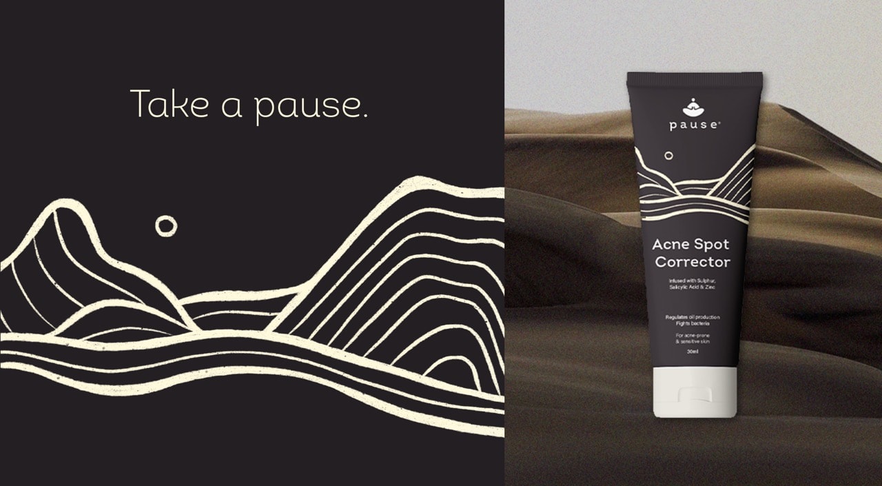
The starting point was purpose, not product. We mapped the brand’s positioning around a single, sharp belief: that skincare for sensitive skin should inform, not overwhelm. From this, we defined the brand archetype - The Sage - anchoring PAUSE in a voice of calm confidence, expertise, and trust. This foundation shaped not just how the brand looked, but how it behaved. Even the brand icon was crafted through the lens of the Sage archetype a visual emblem that reflected quiet wisdom and assured guidance.
Strategically, we shifted the narrative from problem-solving to perspective-building. PAUSE wasn’t positioned as a fix, but as a skincare philosophy, built for those navigating sensitivity, whether caused by biology or burnout. It became a brand grounded in information, designed to guide rather than push. The storytelling, both verbal and visual, was consistently rooted in the Sage, building a calm yet authoritative narrative throughout.
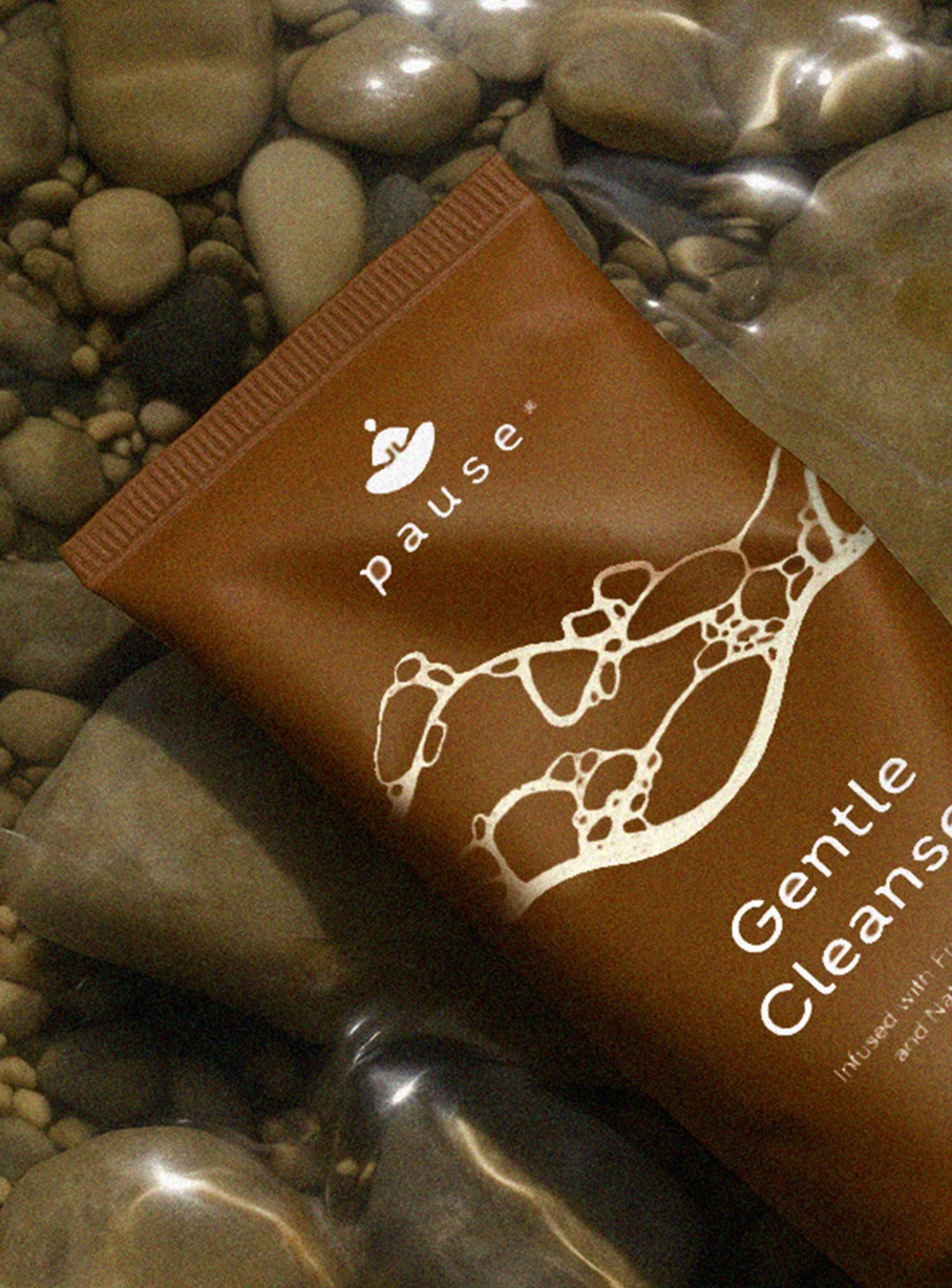
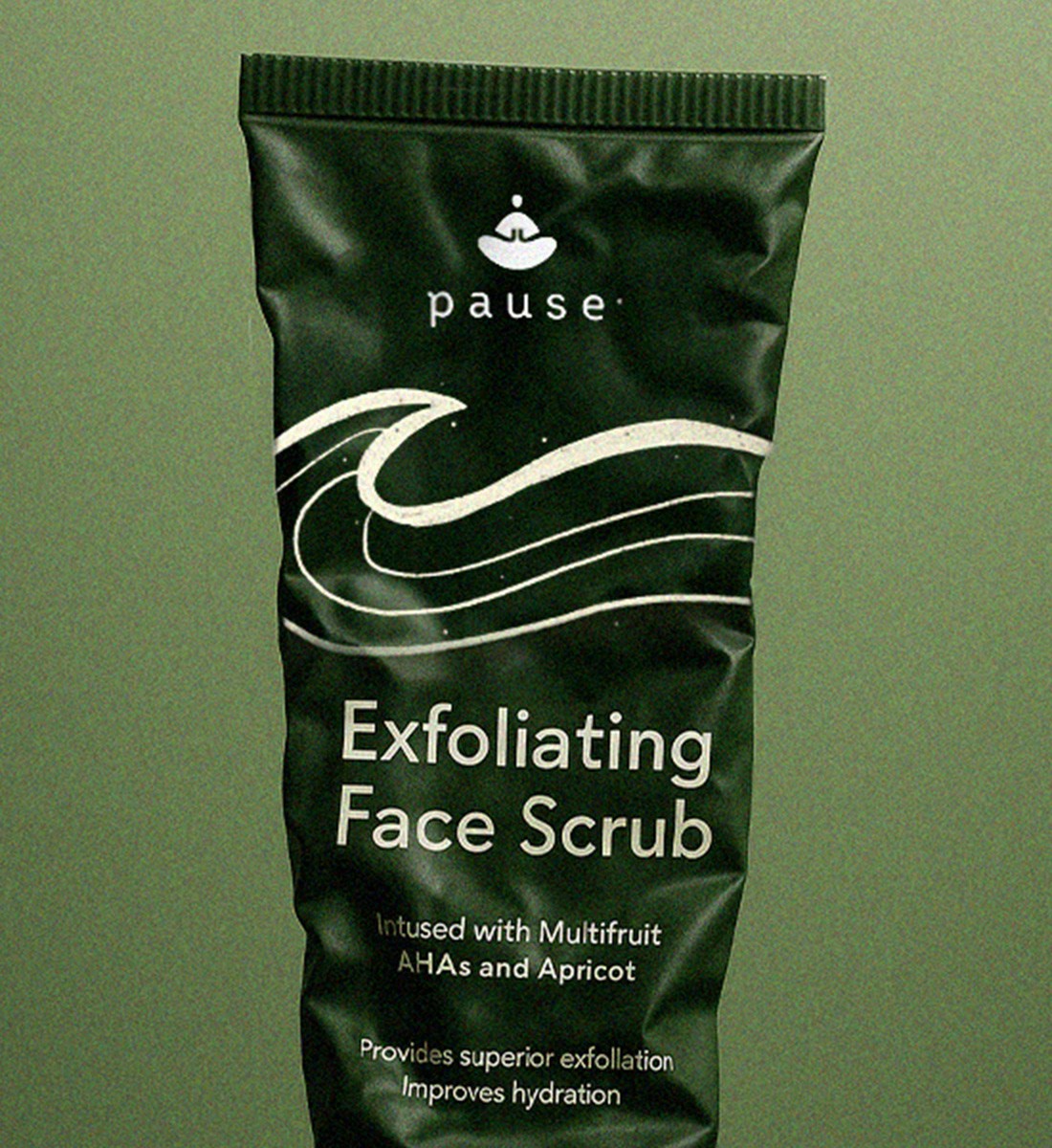
Visually, the brand moved toward a softened aesthetic: organic illustrations, muted palettes, and motion that flowed rather than demanded attention. Every design element, from typography to iconography, was driven by restraint and clarity, in line with the brand’s purpose.
The result: a skincare brand with a distinct voice and visual system tailored for a discerning audience. PAUSE now operates in its lane, focused, informed, and confident in its point of view.


View All Work
Got a project? let’s talk
Prefer reaching out directly?


PAUSE
Skincare
Sensitive skin deserves clarity, not clutter.
Services
Brand Strategy
Archetype Definition
Visual Identity
Verbal Identity
Website Design
UX & UI
Content Architecture
Read more+
In a skincare category dominated by bold claims and reactive trends, PAUSE entered the market with a focused offering: skincare designed specifically for sensitive skin. The intent was clear, but the articulation wasn’t. Our partnership focused on building a brand that could hold its own through clarity, knowledge, and restraint.
The starting point was purpose, not product. We mapped the brand’s positioning around a single, sharp belief: that skincare for sensitive skin should inform, not overwhelm. From this, we defined the brand archetype - The Sage - anchoring PAUSE in a voice of calm confidence, expertise, and trust. This foundation shaped not just how the brand looked, but how it behaved. Even the brand icon was crafted through the lens of the Sage archetype a visual emblem that reflected quiet wisdom and assured guidance.
Strategically, we shifted the narrative from problem-solving to perspective-building. PAUSE wasn’t positioned as a fix, but as a skincare philosophy, built for those navigating sensitivity, whether caused by biology or burnout. It became a brand grounded in information, designed to guide rather than push. The storytelling, both verbal and visual, was consistently rooted in the Sage, building a calm yet authoritative narrative throughout.
Visually, the brand moved toward a softened aesthetic: organic illustrations, muted palettes, and motion that flowed rather than demanded attention. Every design element, from typography to iconography, was driven by restraint and clarity, in line with the brand’s purpose.
The result: a skincare brand with a distinct voice and visual system tailored for a discerning audience. PAUSE now operates in its lane, focused, informed, and confident in its point of view.

View All Work
Got a project? let’s talk
Prefer reaching out directly?
PAUSE
Skincare
Sensitive skin deserves clarity, not clutter.
Services
Brand Strategy
Archetype Definition
Visual Identity
Verbal Identity
Website Design
UX & UI
Content Architecture
Read more+
In a skincare category dominated by bold claims and reactive trends, PAUSE entered the market with a focused offering: skincare designed specifically for sensitive skin. The intent was clear, but the articulation wasn’t. Our partnership focused on building a brand that could hold its own through clarity, knowledge, and restraint.
The starting point was purpose, not product. We mapped the brand’s positioning around a single, sharp belief: that skincare for sensitive skin should inform, not overwhelm. From this, we defined the brand archetype - The Sage - anchoring PAUSE in a voice of calm confidence, expertise, and trust. This foundation shaped not just how the brand looked, but how it behaved. Even the brand icon was crafted through the lens of the Sage archetype a visual emblem that reflected quiet wisdom and assured guidance.
Strategically, we shifted the narrative from problem-solving to perspective-building. PAUSE wasn’t positioned as a fix, but as a skincare philosophy, built for those navigating sensitivity, whether caused by biology or burnout. It became a brand grounded in information, designed to guide rather than push. The storytelling, both verbal and visual, was consistently rooted in the Sage, building a calm yet authoritative narrative throughout.
Visually, the brand moved toward a softened aesthetic: organic illustrations, muted palettes, and motion that flowed rather than demanded attention. Every design element, from typography to iconography, was driven by restraint and clarity, in line with the brand’s purpose.
The result: a skincare brand with a distinct voice and visual system tailored for a discerning audience. PAUSE now operates in its lane, focused, informed, and confident in its point of view.
View All Work
Got a project? let’s talk
Prefer reaching out directly?


PAUSE
Skincare
Sensitive skin deserves clarity, not clutter.
Services
Brand Strategy
Archetype Definition
Visual Identity
Verbal Identity
Website Design
UX & UI
Content Architecture
Read more+
In a skincare category dominated by bold claims and reactive trends, PAUSE entered the market with a focused offering: skincare designed specifically for sensitive skin. The intent was clear, but the articulation wasn’t. Our partnership focused on building a brand that could hold its own through clarity, knowledge, and restraint.
The starting point was purpose, not product. We mapped the brand’s positioning around a single, sharp belief: that skincare for sensitive skin should inform, not overwhelm. From this, we defined the brand archetype - The Sage - anchoring PAUSE in a voice of calm confidence, expertise, and trust. This foundation shaped not just how the brand looked, but how it behaved. Even the brand icon was crafted through the lens of the Sage archetype a visual emblem that reflected quiet wisdom and assured guidance.
Strategically, we shifted the narrative from problem-solving to perspective-building. PAUSE wasn’t positioned as a fix, but as a skincare philosophy, built for those navigating sensitivity, whether caused by biology or burnout. It became a brand grounded in information, designed to guide rather than push. The storytelling, both verbal and visual, was consistently rooted in the Sage, building a calm yet authoritative narrative throughout.
Visually, the brand moved toward a softened aesthetic: organic illustrations, muted palettes, and motion that flowed rather than demanded attention. Every design element, from typography to iconography, was driven by restraint and clarity, in line with the brand’s purpose.
The result: a skincare brand with a distinct voice and visual system tailored for a discerning audience. PAUSE now operates in its lane, focused, informed, and confident in its point of view.

View All Work
Got a project? let’s talk
Prefer reaching out directly?