


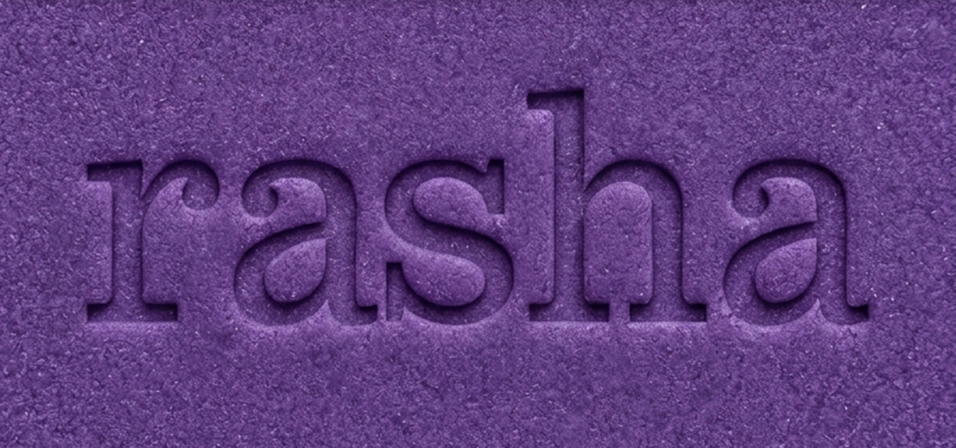
RASHA
Health & Wellness
A brand that invites trust without overwhelming with jargon.
Services
Brand Strategy
Visual Identity
Packaging Design
Product & Pricing
RASHA began as a wellness supplement tailored for women. While the product delivered on function and quality, the brand had more potential than its initial framing allowed. Balance, after all, isn’t a one-size-fits-all state, it's deeply personal, evolving, and multifaceted.
Through our collaboration, RASHA evolved from a niche offering to a lifestyle-first brand built on clarity, credibility, and relevance.
The brand’s shift started with strategic reframing: positioning RASHA as a supplement for those seeking physical, emotional, or mental equilibrium. This wasn’t a loud pivot, but a considered recalibration. The narrative moved from reactive wellness to proactive balance.
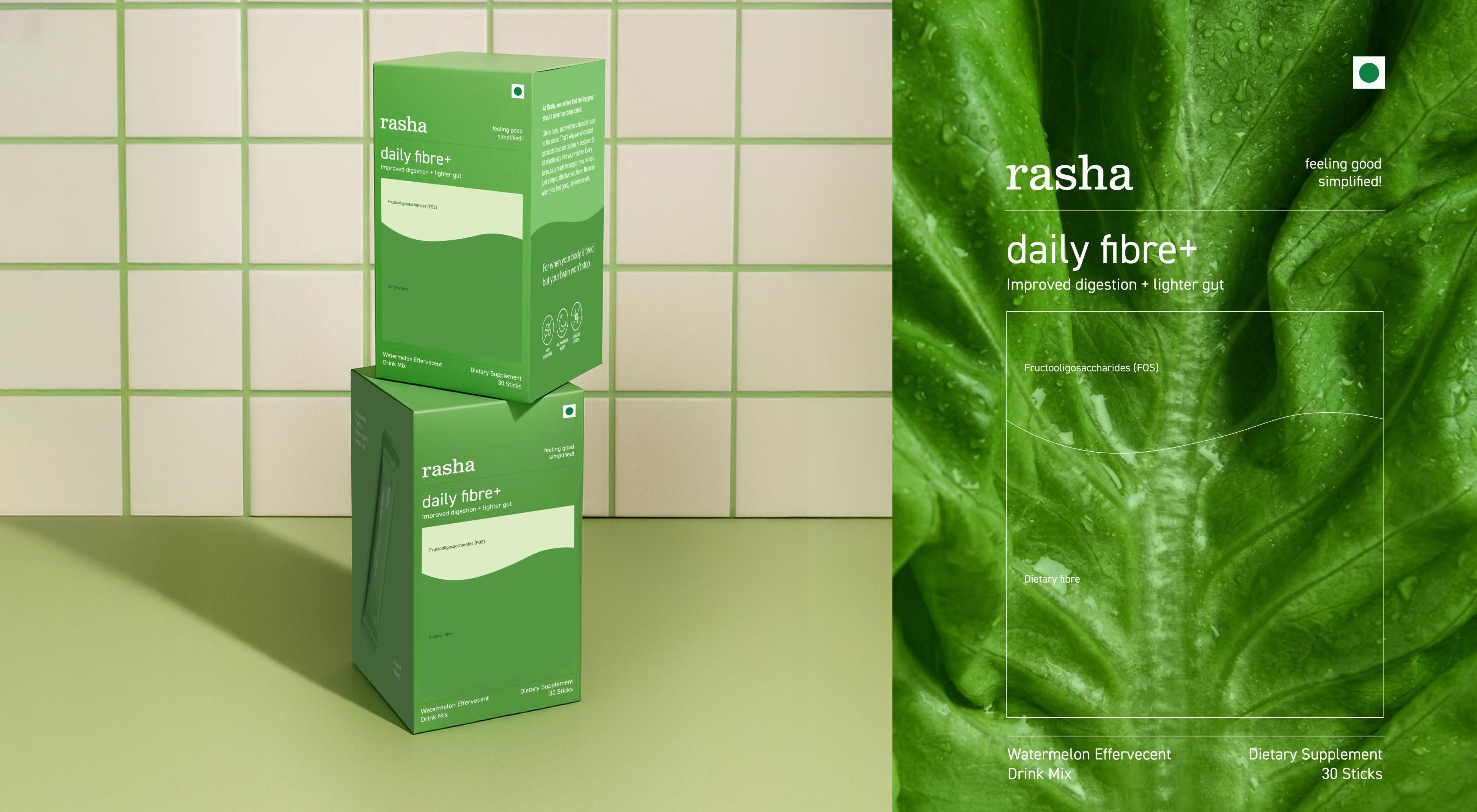
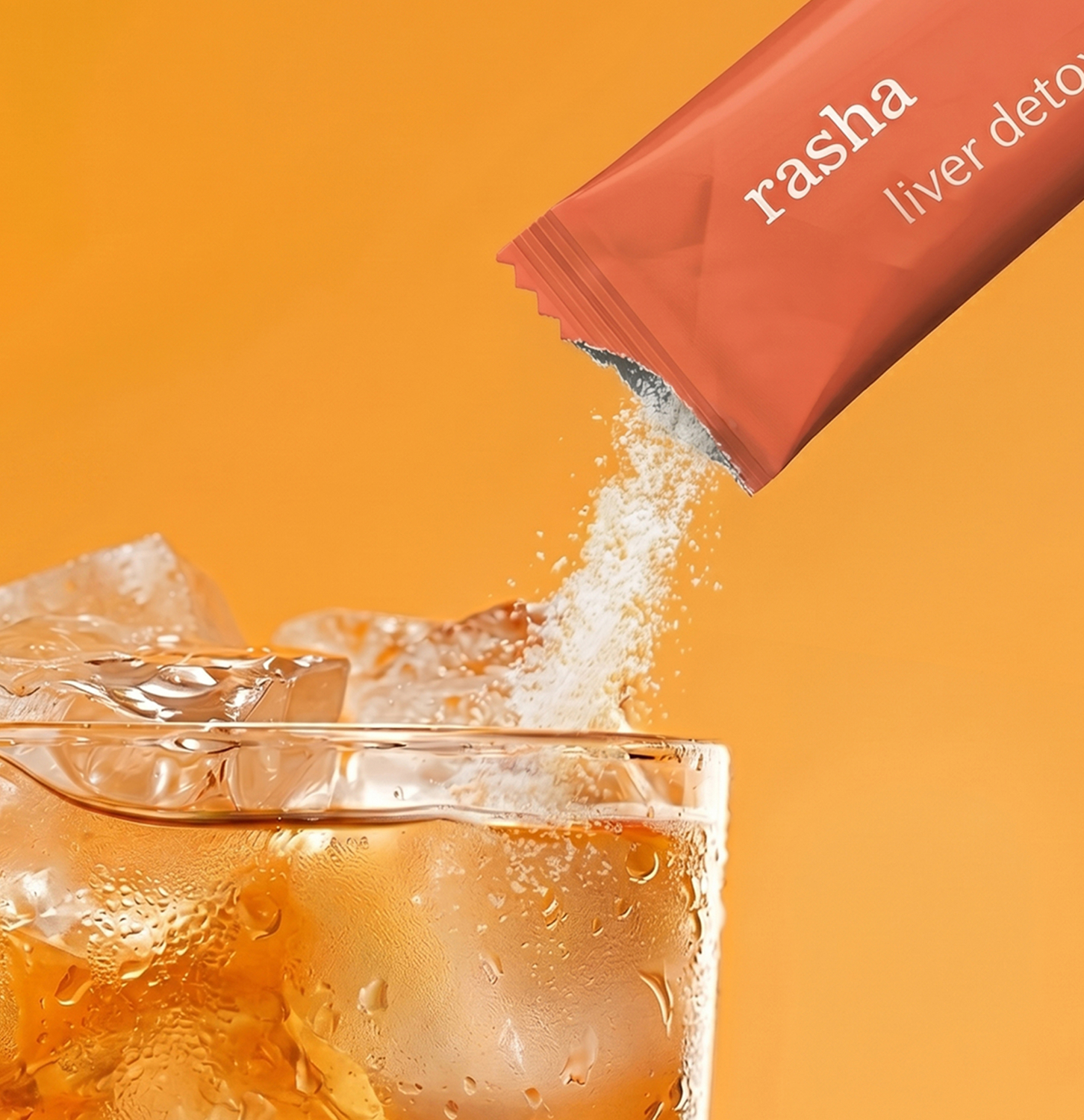
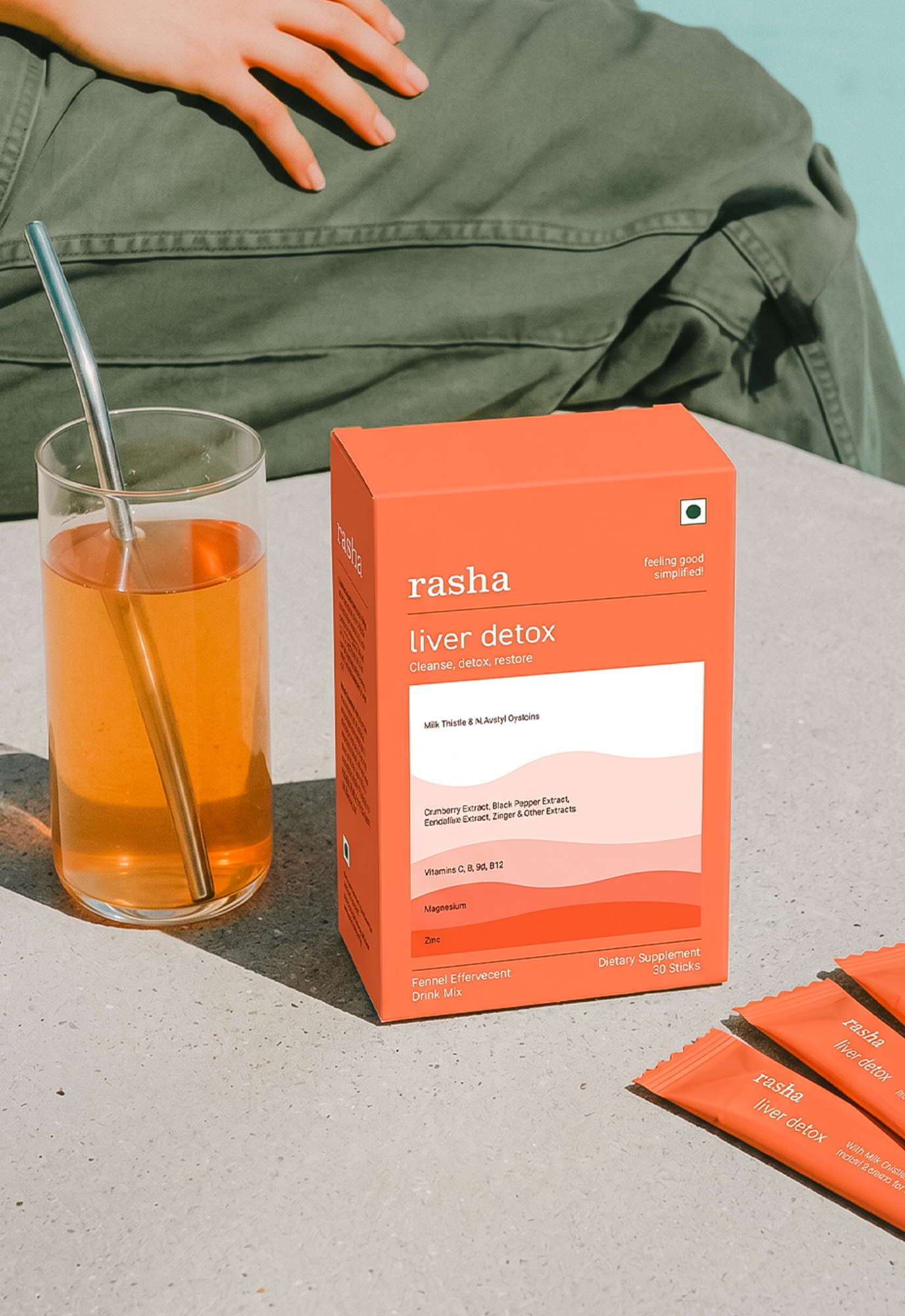
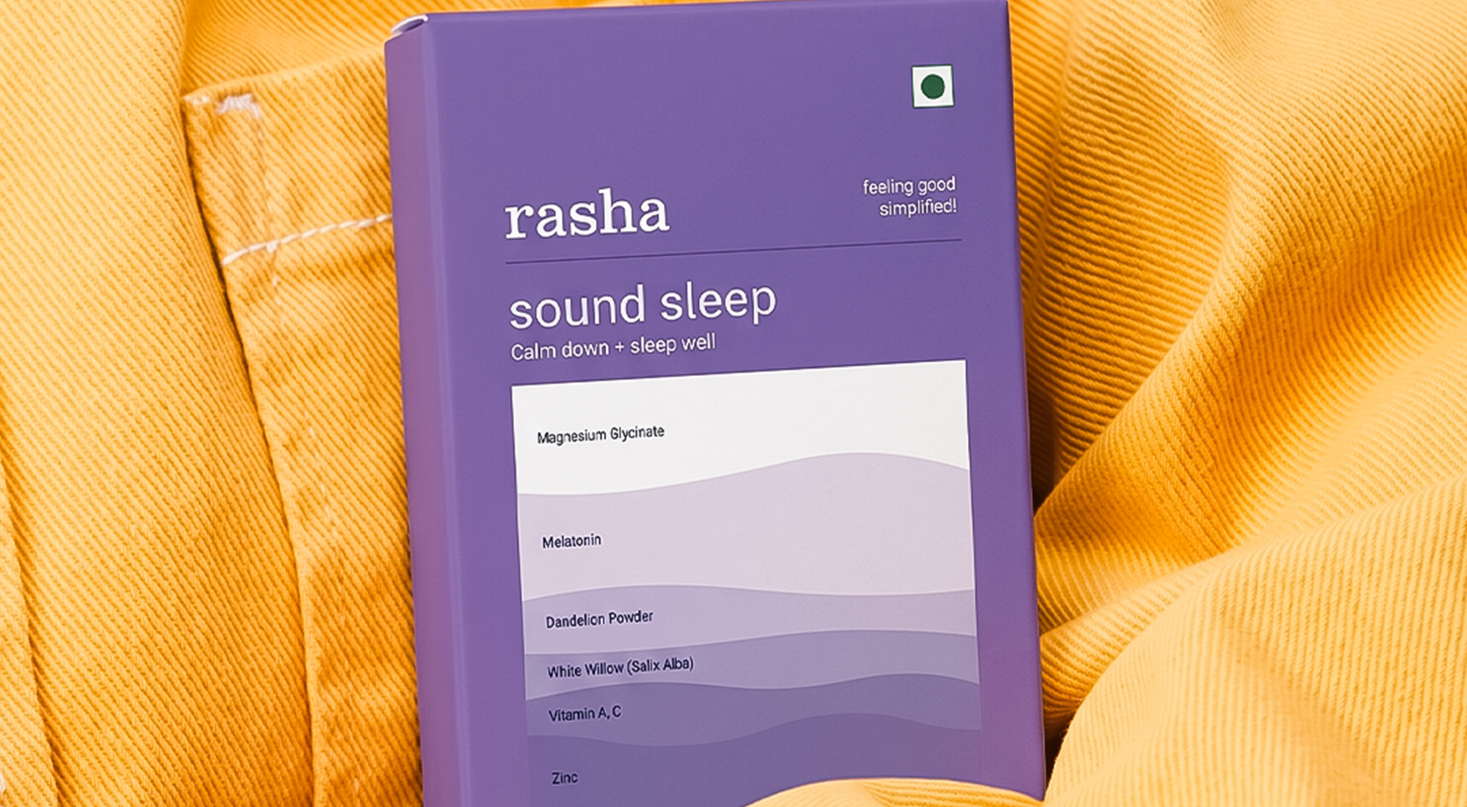
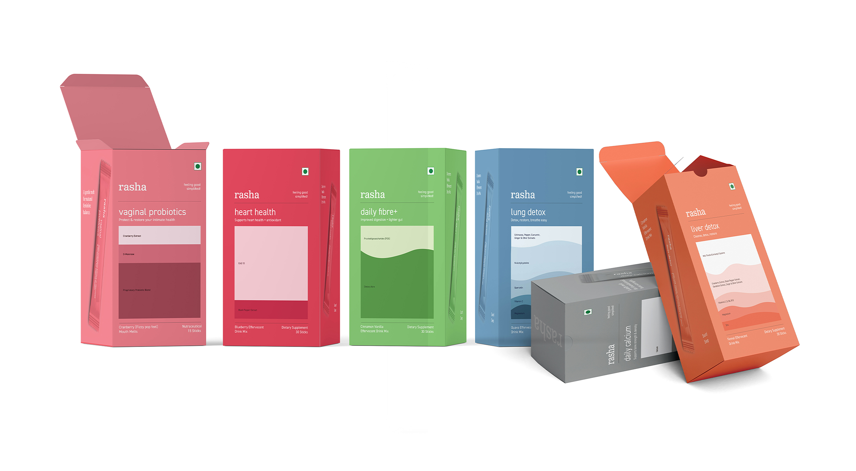
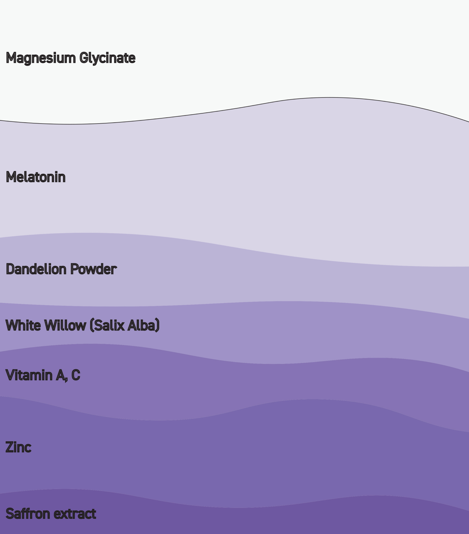
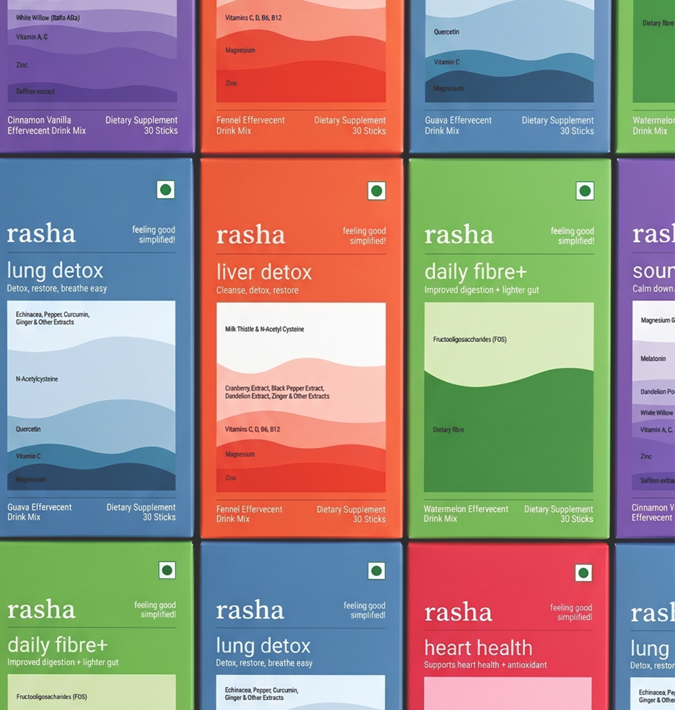
Visually, the design system was built to reflect structure and calm. Packaging used waveforms and signal cues as subtle metaphors for harmony, while layout and colour guided both aesthetic and functionality. The box wasn’t just a container; it became a tool for understanding, making dosage and product intent easier to grasp at a glance.
The visual identity aimed to feel human but informed, personal but not prescriptive. A brand that invites trust without overwhelming with jargon.
The result: RASHA stepped forward with purpose. Shelf presence sharpened, audience widened, and the brand now holds space in the wellness category as a quiet, clear authority designed for life in motion.

View All Work
Got a project? let’s talk
Prefer reaching out directly?


RASHA
Health & Wellness
A brand that invites trust without overwhelming with jargon.
Services
Brand Strategy
Packaging Design
Visual Identity
Product
Pricing
Read more+
RASHA began as a wellness supplement tailored for women. While the product delivered on function and quality, the brand had more potential than its initial framing allowed. Balance, after all, isn’t a one-size-fits-all state, it's deeply personal, evolving, and multifaceted.
Through our collaboration, RASHA evolved from a niche offering to a lifestyle-first brand built on clarity, credibility, and relevance.
The brand’s shift started with strategic reframing: positioning RASHA as a supplement for those seeking physical, emotional, or mental equilibrium. This wasn’t a loud pivot, but a considered recalibration. The narrative moved from reactive wellness to proactive balance.
Visually, the design system was built to reflect structure and calm. Packaging used waveforms and signal cues as subtle metaphors for harmony, while layout and colour guided both aesthetic and functionality. The box wasn’t just a container; it became a tool for understanding, making dosage and product intent easier to grasp at a glance.
The visual identity aimed to feel human but informed, personal but not prescriptive. A brand that invites trust without overwhelming with jargon.
The result: RASHA stepped forward with purpose. Shelf presence sharpened, audience widened, and the brand now holds space in the wellness category as a quiet, clear authority designed for life in motion.

View All Work
Got a project? let’s talk
Prefer reaching out directly?
RASHA
Health & Wellness
A brand that invites trust without overwhelming with jargon.
Services
Brand Strategy
Packaging Design
Visual Identity
Product
Pricing
Read more+
RASHA began as a wellness supplement tailored for women. While the product delivered on function and quality, the brand had more potential than its initial framing allowed. Balance, after all, isn’t a one-size-fits-all state, it's deeply personal, evolving, and multifaceted.
Through our collaboration, RASHA evolved from a niche offering to a lifestyle-first brand built on clarity, credibility, and relevance.
The brand’s shift started with strategic reframing: positioning RASHA as a supplement for those seeking physical, emotional, or mental equilibrium. This wasn’t a loud pivot, but a considered recalibration. The narrative moved from reactive wellness to proactive balance.
Visually, the design system was built to reflect structure and calm. Packaging used waveforms and signal cues as subtle metaphors for harmony, while layout and colour guided both aesthetic and functionality. The box wasn’t just a container; it became a tool for understanding, making dosage and product intent easier to grasp at a glance.
The visual identity aimed to feel human but informed, personal but not prescriptive. A brand that invites trust without overwhelming with jargon.
The result: RASHA stepped forward with purpose. Shelf presence sharpened, audience widened, and the brand now holds space in the wellness category as a quiet, clear authority designed for life in motion.
View All Work
Got a project? let’s talk
Prefer reaching out directly?


RASHA
Health & Wellness
A brand that invites trust without overwhelming with jargon.
Services
Brand Strategy
Packaging Design
Visual Identity
Product
Pricing
Read more+
RASHA began as a wellness supplement tailored for women. While the product delivered on function and quality, the brand had more potential than its initial framing allowed. Balance, after all, isn’t a one-size-fits-all state, it's deeply personal, evolving, and multifaceted.
Through our collaboration, RASHA evolved from a niche offering to a lifestyle-first brand built on clarity, credibility, and relevance.
The brand’s shift started with strategic reframing: positioning RASHA as a supplement for those seeking physical, emotional, or mental equilibrium. This wasn’t a loud pivot, but a considered recalibration. The narrative moved from reactive wellness to proactive balance.
Visually, the design system was built to reflect structure and calm. Packaging used waveforms and signal cues as subtle metaphors for harmony, while layout and colour guided both aesthetic and functionality. The box wasn’t just a container; it became a tool for understanding, making dosage and product intent easier to grasp at a glance.
The visual identity aimed to feel human but informed, personal but not prescriptive. A brand that invites trust without overwhelming with jargon.
The result: RASHA stepped forward with purpose. Shelf presence sharpened, audience widened, and the brand now holds space in the wellness category as a quiet, clear authority designed for life in motion.

View All Work
Got a project? let’s talk
Prefer reaching out directly?