


Spicta
Oral Care
Oral care doesn’t have to taste like routine.
Services
Visual Identity Refresh
Subtle Rebranding
Packaging Design
Brand Strategy
In a category saturated with clinical tropes and sterile visuals, Spicta had something rare: flavour-forward oral care rooted in ingredient integrity. But its brand presence didn’t reflect that promise. The product was premium, but the positioning wasn’t.
This was never about starting over. It was about precision. Together, we refreshed Spicta’s identity, subtly but strategically.
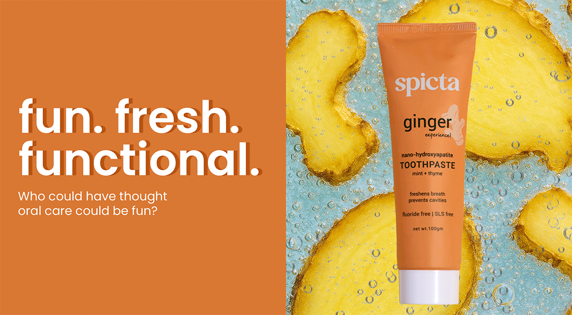
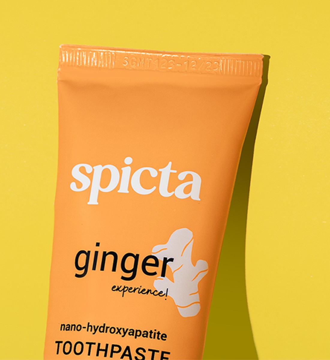
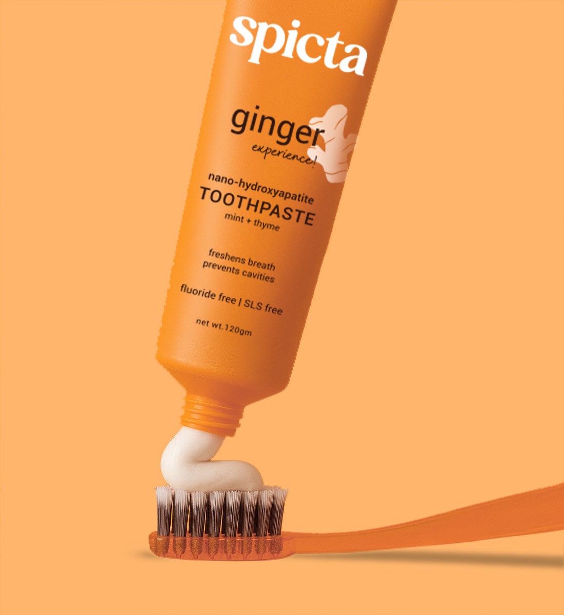
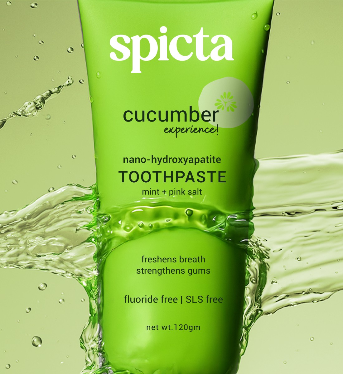
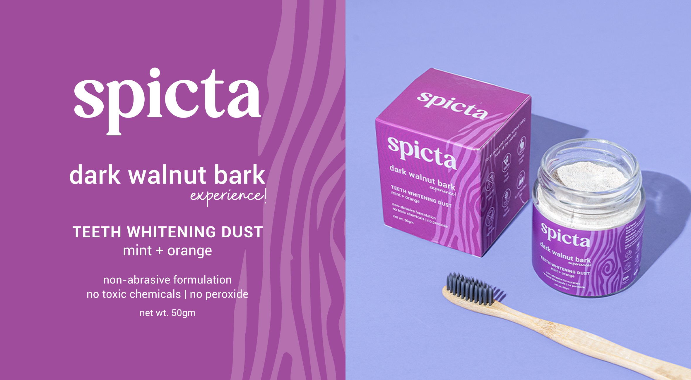
The shift began with flavour. We positioned Spicta as a sensorial oral care brand- modern, clean, and distinctly experiential. Instead of leading with “minty freshness,” we built narratives around unique combinations, textures, and ingredients that felt both enhanced and approachable. The strategy leaned into storytelling that celebrated the everyday ritual of oral care with more personality and less prescription.
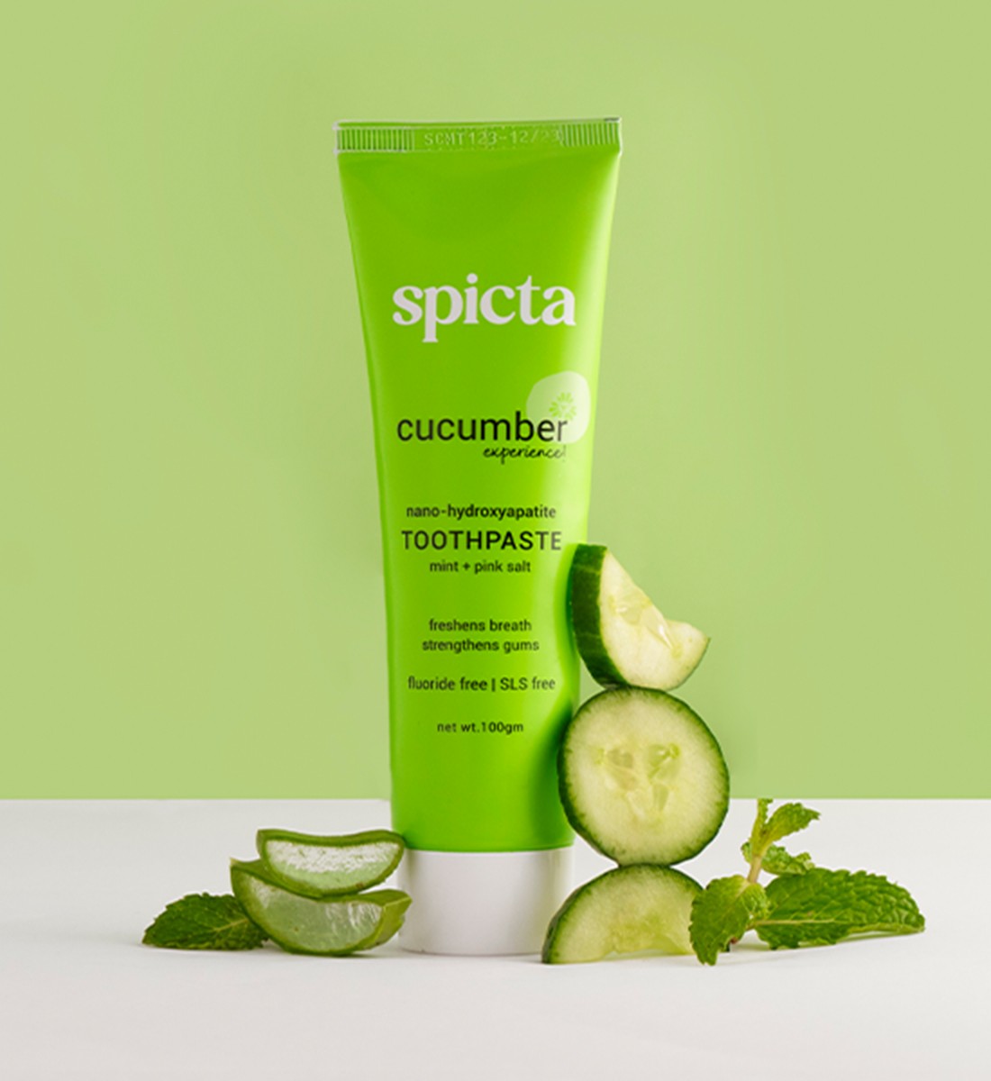
Each variant was positioned as an experience, like the crisp, hydrating freshness of cucumber, designed to elevate how you begin your day. The strategy leaned into storytelling that celebrated the everyday ritual of oral care with more personality and less prescription.
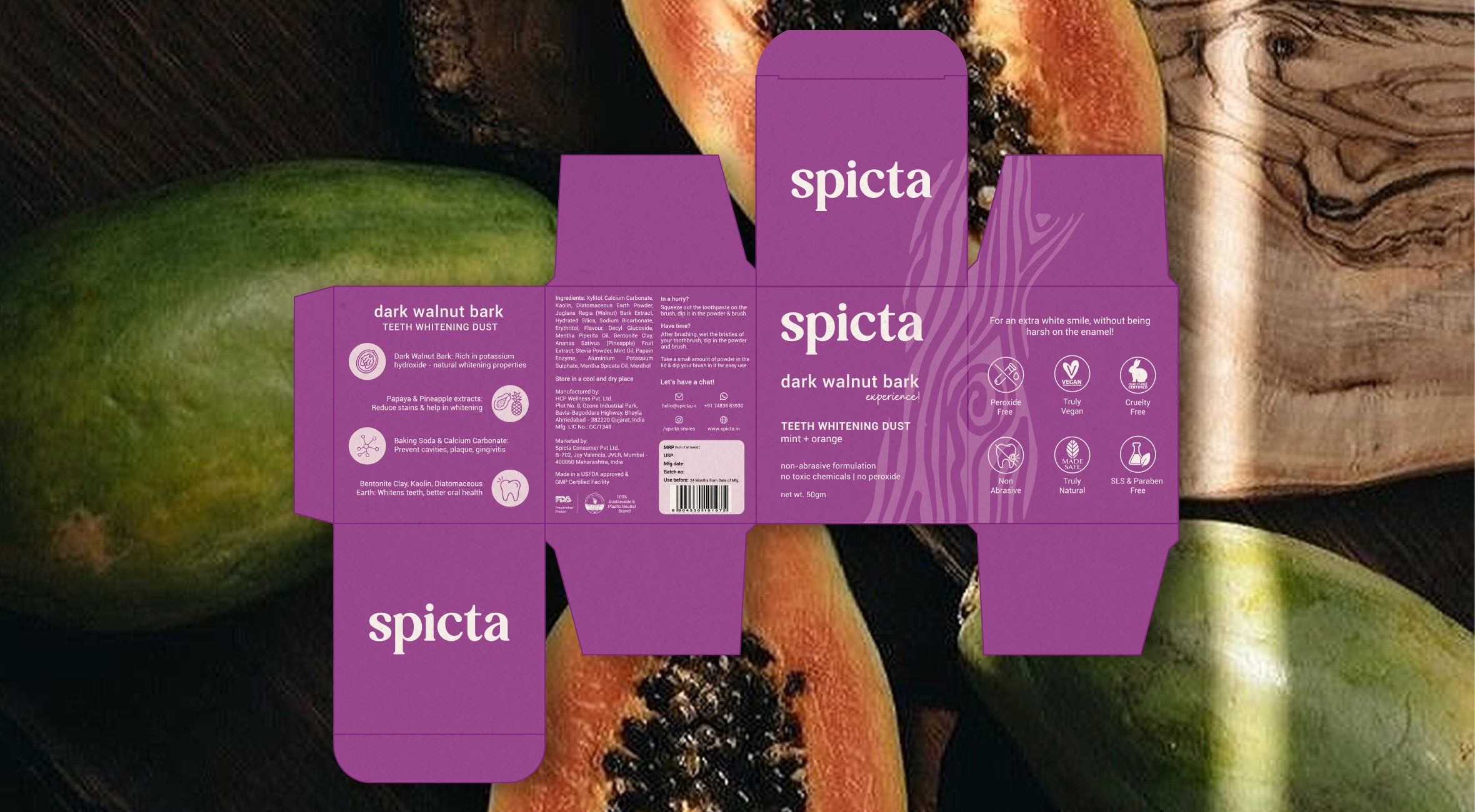
Visually, the identity evolved with restraint. The logo was refined. Typography was modernised. A vibrant colour palette and focused packaging layout allowed for clarity and shelf impact without losing familiarity. We brought the ingredients to the forefront, heroed not with loud claims, but with deliberate design that invites discovery.

View All Work
Got a project? let’s talk
Prefer reaching out directly?


Spicta
Oral Care
A brand that invites trust without overwhelming with jargon.
Services
Visual Identity Refresh
Subtle Rebranding
Packaging Design
Brand Strategy
Read more+
In a category saturated with clinical tropes and sterile visuals, Spicta had something rare: flavour-forward oral care rooted in ingredient integrity. But its brand presence didn’t reflect that promise. The product was premium, but the positioning wasn’t.
This was never about starting over. It was about precision. Together, we refreshed Spicta’s identity, subtly but strategically.
The shift began with flavour. We positioned Spicta as a sensorial oral care brand- modern, clean, and distinctly experiential. Instead of leading with “minty freshness,” we built narratives around unique combinations, textures, and ingredients that felt both enhanced and approachable. The strategy leaned into storytelling that celebrated the everyday ritual of oral care with more personality and less prescription.
Each variant was positioned as an experience, like the crisp, hydrating freshness of cucumber, designed to elevate how you begin your day. The strategy leaned into storytelling that celebrated the everyday ritual of oral care with more personality and less prescription.
Visually, the identity evolved with restraint. The logo was refined. Typography was modernised. A vibrant colour palette and focused packaging layout allowed for clarity and shelf impact without losing familiarity. We brought the ingredients to the forefront, heroed not with loud claims, but with deliberate design that invites discovery.

View All Work
Got a project? let’s talk
Prefer reaching out directly?
Spicta
Oral Care
A brand that invites trust without overwhelming with jargon.
Services
Visual Identity Refresh
Subtle Rebranding
Packaging Design
Brand Strategy
Read more+
In a category saturated with clinical tropes and sterile visuals, Spicta had something rare: flavour-forward oral care rooted in ingredient integrity. But its brand presence didn’t reflect that promise. The product was premium, but the positioning wasn’t.
This was never about starting over. It was about precision. Together, we refreshed Spicta’s identity, subtly but strategically.
The shift began with flavour. We positioned Spicta as a sensorial oral care brand- modern, clean, and distinctly experiential. Instead of leading with “minty freshness,” we built narratives around unique combinations, textures, and ingredients that felt both enhanced and approachable. The strategy leaned into storytelling that celebrated the everyday ritual of oral care with more personality and less prescription.
Each variant was positioned as an experience, like the crisp, hydrating freshness of cucumber, designed to elevate how you begin your day. The strategy leaned into storytelling that celebrated the everyday ritual of oral care with more personality and less prescription.
Visually, the identity evolved with restraint. The logo was refined. Typography was modernised. A vibrant colour palette and focused packaging layout allowed for clarity and shelf impact without losing familiarity. We brought the ingredients to the forefront, heroed not with loud claims, but with deliberate design that invites discovery.
View All Work
Got a project? let’s talk
Prefer reaching out directly?


Spicta
Oral Care
A brand that invites trust without overwhelming with jargon.
Services
Visual Identity Refresh
Subtle Rebranding
Packaging Design
Brand Strategy
Read more+
In a category saturated with clinical tropes and sterile visuals, Spicta had something rare: flavour-forward oral care rooted in ingredient integrity. But its brand presence didn’t reflect that promise. The product was premium, but the positioning wasn’t.
This was never about starting over. It was about precision. Together, we refreshed Spicta’s identity, subtly but strategically.
The shift began with flavour. We positioned Spicta as a sensorial oral care brand- modern, clean, and distinctly experiential. Instead of leading with “minty freshness,” we built narratives around unique combinations, textures, and ingredients that felt both enhanced and approachable. The strategy leaned into storytelling that celebrated the everyday ritual of oral care with more personality and less prescription.
Each variant was positioned as an experience, like the crisp, hydrating freshness of cucumber, designed to elevate how you begin your day. The strategy leaned into storytelling that celebrated the everyday ritual of oral care with more personality and less prescription.
Visually, the identity evolved with restraint. The logo was refined. Typography was modernised. A vibrant colour palette and focused packaging layout allowed for clarity and shelf impact without losing familiarity. We brought the ingredients to the forefront, heroed not with loud claims, but with deliberate design that invites discovery.

View All Work
Got a project? let’s talk
Prefer reaching out directly?