


TEGO
Performance Wear
Built for everyday athletes who train with focus.
Services
Brand Strategy
Visual Identity
Brand Book
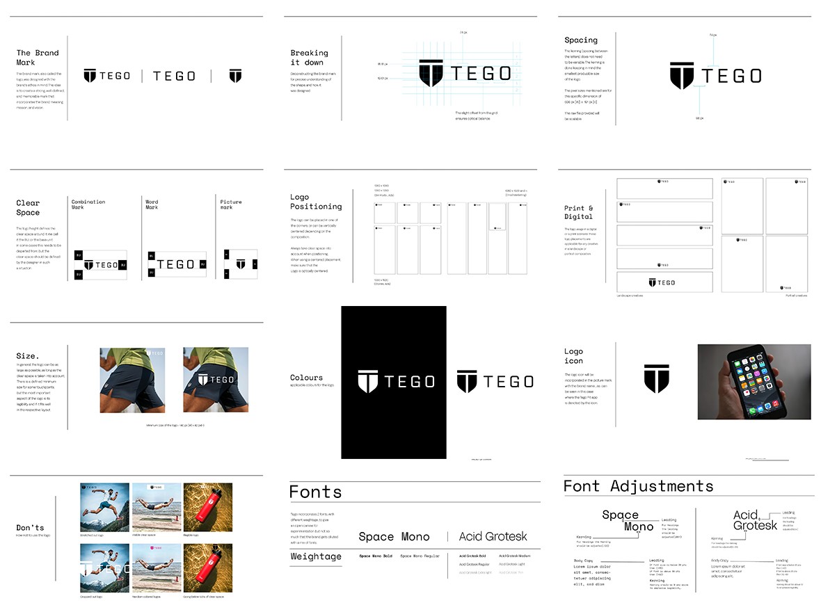
TEGO was not new to performance. It had a premium product, a defined customer, and a belief in discipline. What it needed was coherence. Our partnership focused on transforming scattered visual cues into a system that could scale without losing its edge.
We began with fundamentals. TEGO was not just another fitness brand. It was built for everyday athletes who train with focus. This principle shaped every part of the strategy. The brand needed to feel intentional, intelligent, and rooted in a movement that mattered. We framed TEGO as a mindset brand that values precision, progress, and presence.
The visual identity was stripped back to sharpen meaning. Typography was selected for pace and clarity. The colour palette stayed strong and minimal, supporting the brand’s no-nonsense stance. We introduced a design grid that could work across packaging, digital, and communication without ever needing to be adapted. It was built to hold up, not just look good.
More than assets, we created alignment. The TEGO brand book was not a static file. It became the reference for how a single post was written. Voice, structure, use of motion, product framing, and iconography, every component was treated as part of a larger system.
The outcome was more than visual unity. It was brand literacy. TEGO now operates with precision across every touchpoint. The brand speaks, looks cohesive, and holds its position in the premium performance space without having to shout.

View All Work
Got a project? let’s talk
Prefer reaching out directly?


TEGO
Performance Wear
Built for everyday athletes who train with focus.
Services
Brand Strategy
Visual Identity
Brand Book
Read more+
TEGO was not new to performance. It had a premium product, a defined customer, and a belief in discipline. What it needed was coherence. Our partnership focused on transforming scattered visual cues into a system that could scale without losing its edge.
We began with fundamentals. TEGO was not just another fitness brand. It was built for everyday athletes who train with focus. This principle shaped every part of the strategy. The brand needed to feel intentional, intelligent, and rooted in a movement that mattered. We framed TEGO as a mindset brand that values precision, progress, and presence.
The visual identity was stripped back to sharpen meaning. Typography was selected for pace and clarity. The colour palette stayed strong and minimal, supporting the brand’s no-nonsense stance. We introduced a design grid that could work across packaging, digital, and communication without ever needing to be adapted. It was built to hold up, not just look good.
More than assets, we created alignment. The TEGO brand book was not a static file. It became the reference for how a single post was written. Voice, structure, use of motion, product framing, and iconography, every component was treated as part of a larger system.
The outcome was more than visual unity. It was brand literacy. TEGO now operates with precision across every touchpoint. The brand speaks, looks cohesive, and holds its position in the premium performance space without having to shout.

View All Work
Got a project? let’s talk
Prefer reaching out directly?
TEGO
Performance Wear
Built for everyday athletes who train with focus.
Services
Brand Strategy
Visual Identity
Brand Book
Read more+
TEGO was not new to performance. It had a premium product, a defined customer, and a belief in discipline. What it needed was coherence. Our partnership focused on transforming scattered visual cues into a system that could scale without losing its edge.
We began with fundamentals. TEGO was not just another fitness brand. It was built for everyday athletes who train with focus. This principle shaped every part of the strategy. The brand needed to feel intentional, intelligent, and rooted in a movement that mattered. We framed TEGO as a mindset brand that values precision, progress, and presence.
The visual identity was stripped back to sharpen meaning. Typography was selected for pace and clarity. The colour palette stayed strong and minimal, supporting the brand’s no-nonsense stance. We introduced a design grid that could work across packaging, digital, and communication without ever needing to be adapted. It was built to hold up, not just look good.
More than assets, we created alignment. The TEGO brand book was not a static file. It became the reference for how a single post was written. Voice, structure, use of motion, product framing, and iconography, every component was treated as part of a larger system.
The outcome was more than visual unity. It was brand literacy. TEGO now operates with precision across every touchpoint. The brand speaks, looks cohesive, and holds its position in the premium performance space without having to shout.
View All Work
Got a project? let’s talk
Prefer reaching out directly?


TEGO
Performance Wear
Built for everyday athletes who train with focus.
Services
Brand Strategy
Visual Identity
Brand Book
Read more+
TEGO was not new to performance. It had a premium product, a defined customer, and a belief in discipline. What it needed was coherence. Our partnership focused on transforming scattered visual cues into a system that could scale without losing its edge.
We began with fundamentals. TEGO was not just another fitness brand. It was built for everyday athletes who train with focus. This principle shaped every part of the strategy. The brand needed to feel intentional, intelligent, and rooted in a movement that mattered. We framed TEGO as a mindset brand that values precision, progress, and presence.
The visual identity was stripped back to sharpen meaning. Typography was selected for pace and clarity. The colour palette stayed strong and minimal, supporting the brand’s no-nonsense stance. We introduced a design grid that could work across packaging, digital, and communication without ever needing to be adapted. It was built to hold up, not just look good.
More than assets, we created alignment. The TEGO brand book was not a static file. It became the reference for how a single post was written. Voice, structure, use of motion, product framing, and iconography, every component was treated as part of a larger system.
The outcome was more than visual unity. It was brand literacy. TEGO now operates with precision across every touchpoint. The brand speaks, looks cohesive, and holds its position in the premium performance space without having to shout.

View All Work
Got a project? let’s talk
Prefer reaching out directly?