


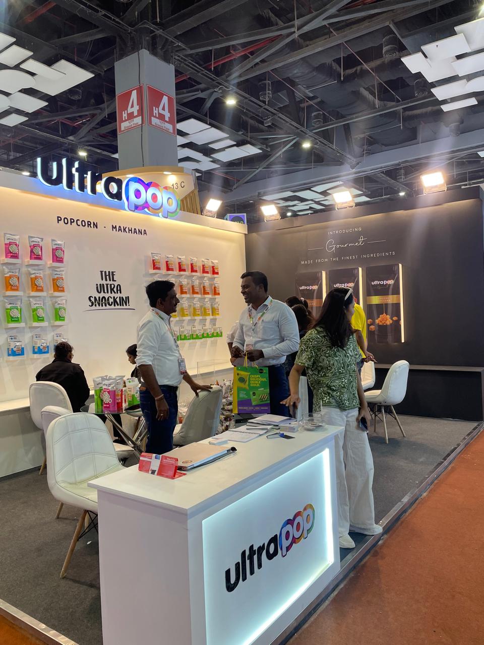
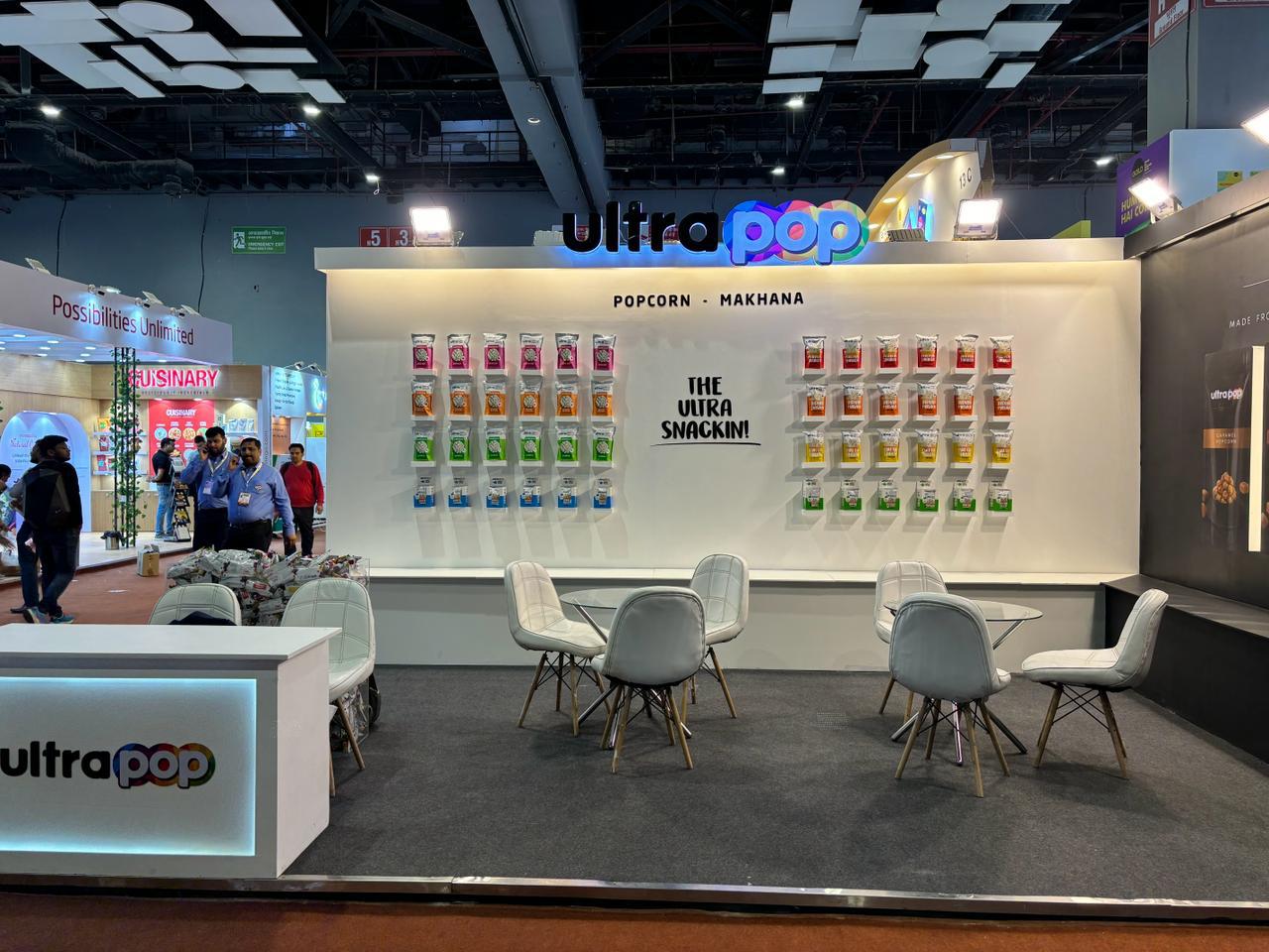
Ultrapop
Food & Beverage – Snack Foods
From snack to spectacle, at Ultrapop’s festival debut
Services
Experience Design
Packaging Extension
On-Ground Activation
Merch Strategy
Ultrapop had the flavour. What it needed was a moment. In a category that thrives on impulse, it wasn’t enough to be tasty, Ultrapop had to be unforgettable. With a high-energy product and a Gen Z audience on the radar, the opportunity wasn’t just to launch, but to land. Loudly.
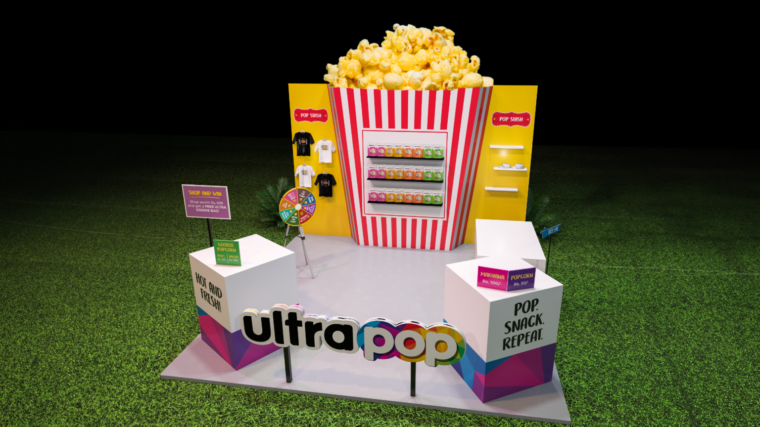
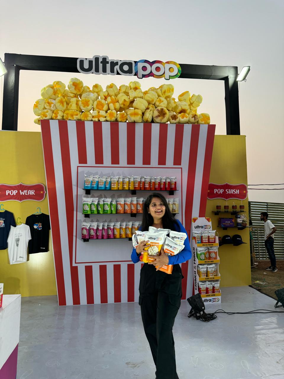
This wasn’t about putting up a booth. It was about building a cultural blip.With a music festival on the horizon, we shaped Ultrapop’s first on-ground brand moment: bold, irreverent, and designed to live on feeds long after the lights went out.
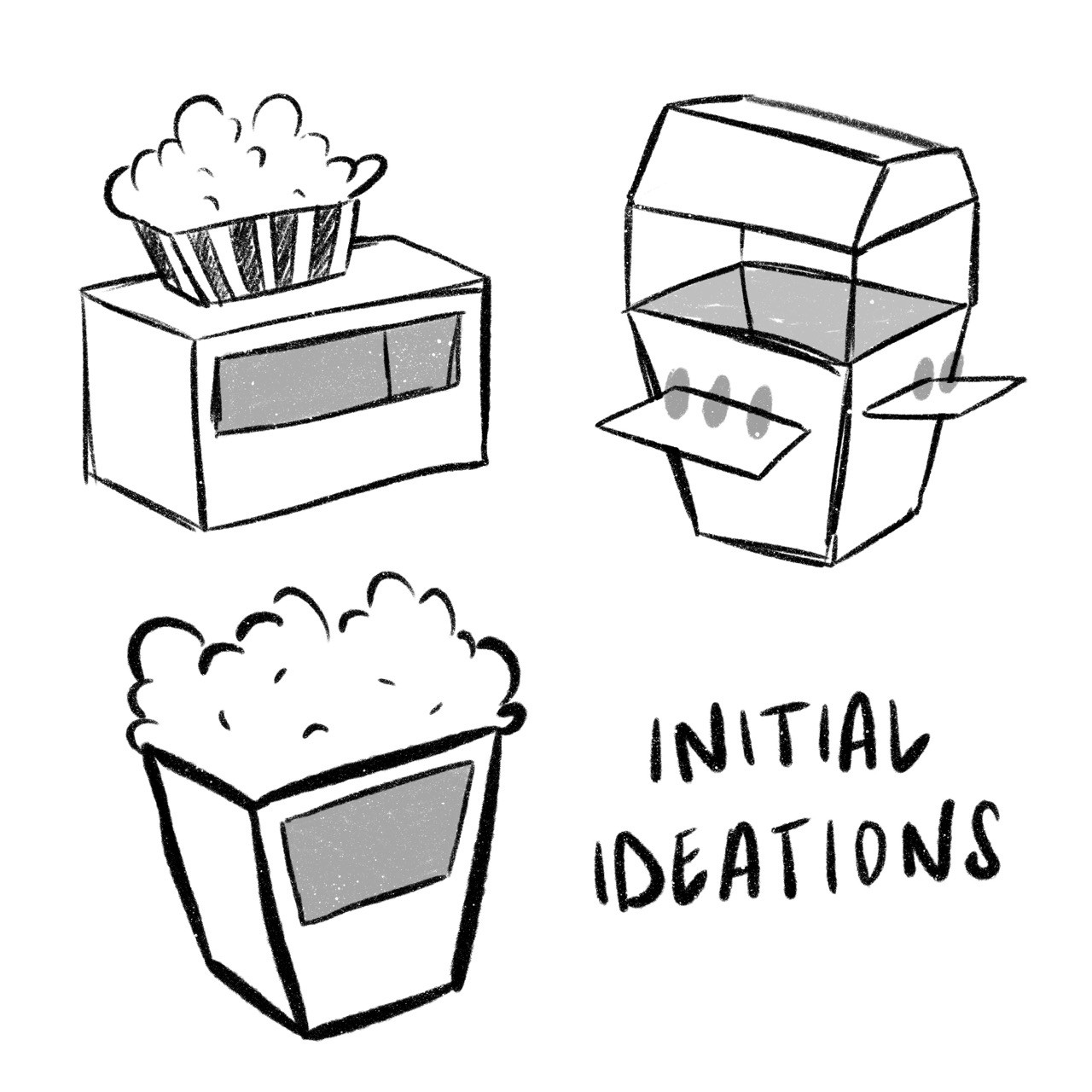
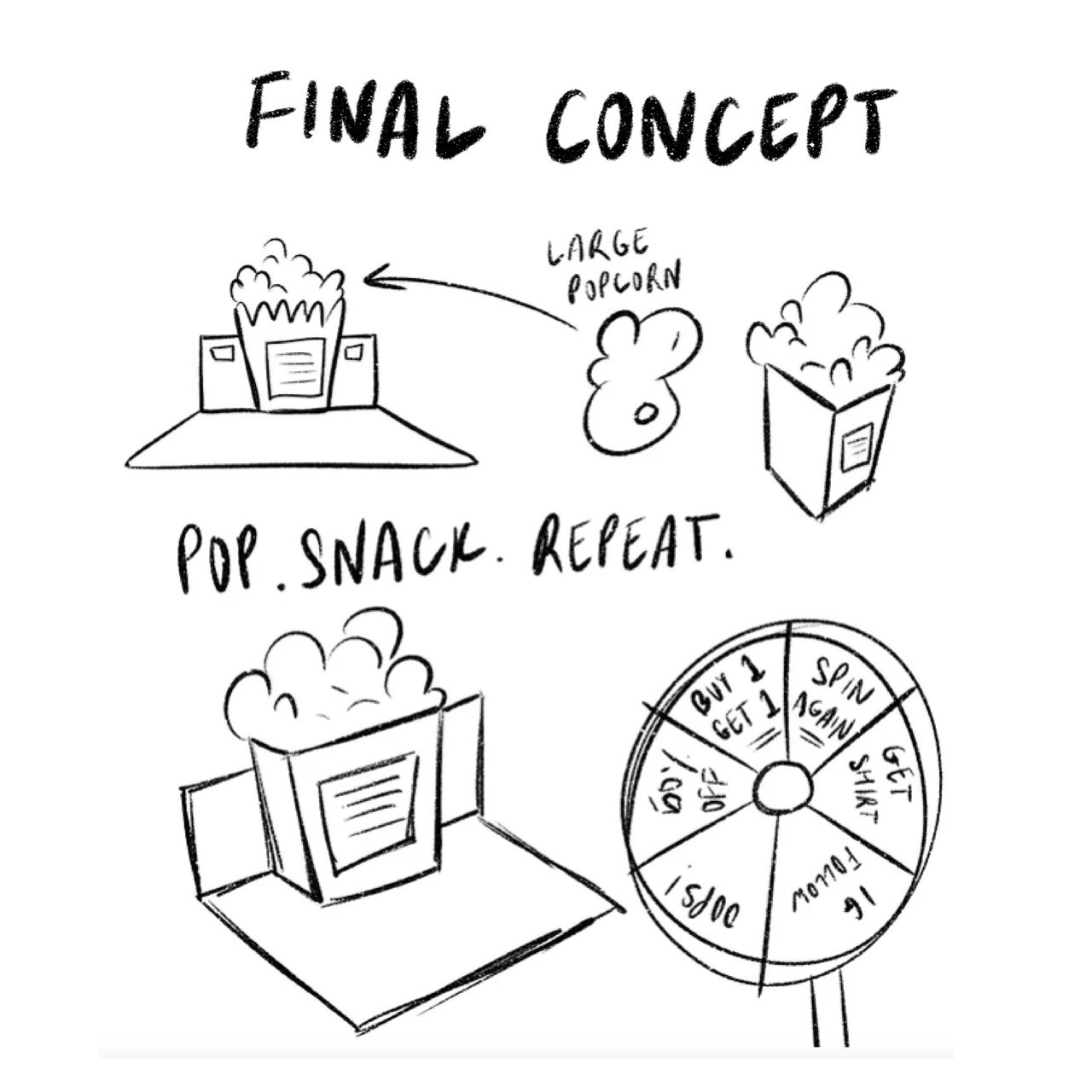
Our strategy started with behavioural cues: how does Gen Z interact with snack brands in a physical space? What makes them stay, post, and tag?From psychology to scroll habits, we mapped it all. What emerged was a clear pattern: interactivity, aesthetics, and novelty fuel attention. That insight drove everything: the spin wheel, the setup, the storytelling.
Visually, the design was maximalist with intent. Typography screamed, colours clashed in all the right ways, and every element, from packaging to signage, served the experience. The space was equal parts sampling zone and content generator. Branded tees, oversized tubs, and layered textures ensured that people didn’t just taste Ultrapop, they remembered it.
The outcome? A snack brand that didn’t just show up, it showed off. Footfall turned into buzz. Merchandise became memorabilia. And the product, already loved, was now part of a lifestyle.

View All Work
Got a project? let’s talk
Prefer reaching out directly?


Ultrapop
Food & Beverage – Snack Foods
From snack to spectacle, at Ultrapop’s festival debut
Services
Experience Design
Packaging Extension
On-Ground Activation
Merch Strategy
Read more+
In a category saturated with clinical tropes and sterile visuals, Spicta had something rare: flavour-forward oral care rooted in ingredient integrity. But its brand presence didn’t reflect that promise. The product was premium, but the positioning wasn’t.
This was never about starting over. It was about precision. Together, we refreshed Spicta’s identity, subtly but strategically.
The shift began with flavour. We positioned Spicta as a sensorial oral care brand- modern, clean, and distinctly experiential. Instead of leading with “minty freshness,” we built narratives around unique combinations, textures, and ingredients that felt both enhanced and approachable. The strategy leaned into storytelling that celebrated the everyday ritual of oral care with more personality and less prescription.
Each variant was positioned as an experience, like the crisp, hydrating freshness of cucumber, designed to elevate how you begin your day. The strategy leaned into storytelling that celebrated the everyday ritual of oral care with more personality and less prescription.
Visually, the identity evolved with restraint. The logo was refined. Typography was modernised. A vibrant colour palette and focused packaging layout allowed for clarity and shelf impact without losing familiarity. We brought the ingredients to the forefront, heroed not with loud claims, but with deliberate design that invites discovery.

View All Work
Got a project? let’s talk
Prefer reaching out directly?
Ultrapop
Food & Beverage – Snack Foods
From snack to spectacle, at Ultrapop’s festival debut
Services
Experience Design
Packaging Extension
On-Ground Activation
Merch Strategy
Read more+
In a category saturated with clinical tropes and sterile visuals, Spicta had something rare: flavour-forward oral care rooted in ingredient integrity. But its brand presence didn’t reflect that promise. The product was premium, but the positioning wasn’t.
This was never about starting over. It was about precision. Together, we refreshed Spicta’s identity, subtly but strategically.
The shift began with flavour. We positioned Spicta as a sensorial oral care brand- modern, clean, and distinctly experiential. Instead of leading with “minty freshness,” we built narratives around unique combinations, textures, and ingredients that felt both enhanced and approachable. The strategy leaned into storytelling that celebrated the everyday ritual of oral care with more personality and less prescription.
Each variant was positioned as an experience, like the crisp, hydrating freshness of cucumber, designed to elevate how you begin your day. The strategy leaned into storytelling that celebrated the everyday ritual of oral care with more personality and less prescription.
Visually, the identity evolved with restraint. The logo was refined. Typography was modernised. A vibrant colour palette and focused packaging layout allowed for clarity and shelf impact without losing familiarity. We brought the ingredients to the forefront, heroed not with loud claims, but with deliberate design that invites discovery.
View All Work
Got a project? let’s talk
Prefer reaching out directly?


Ultrapop
Food & Beverage – Snack Foods
From snack to spectacle, at Ultrapop’s festival debut
Services
Experience Design
Packaging Extension
On-Ground Activation
Merch Strategy
Read more+
In a category saturated with clinical tropes and sterile visuals, Spicta had something rare: flavour-forward oral care rooted in ingredient integrity. But its brand presence didn’t reflect that promise. The product was premium, but the positioning wasn’t.
This was never about starting over. It was about precision. Together, we refreshed Spicta’s identity, subtly but strategically.
The shift began with flavour. We positioned Spicta as a sensorial oral care brand- modern, clean, and distinctly experiential. Instead of leading with “minty freshness,” we built narratives around unique combinations, textures, and ingredients that felt both enhanced and approachable. The strategy leaned into storytelling that celebrated the everyday ritual of oral care with more personality and less prescription.
Each variant was positioned as an experience, like the crisp, hydrating freshness of cucumber, designed to elevate how you begin your day. The strategy leaned into storytelling that celebrated the everyday ritual of oral care with more personality and less prescription.
Visually, the identity evolved with restraint. The logo was refined. Typography was modernised. A vibrant colour palette and focused packaging layout allowed for clarity and shelf impact without losing familiarity. We brought the ingredients to the forefront, heroed not with loud claims, but with deliberate design that invites discovery.

View All Work
Got a project? let’s talk
Prefer reaching out directly?