


ZOORI
Fine Jewellery · D2C Luxury
Clarity-first luxury brand
Services
Brand Strategy
Visual Identity
Naming
Brand Book
Website UI/UX
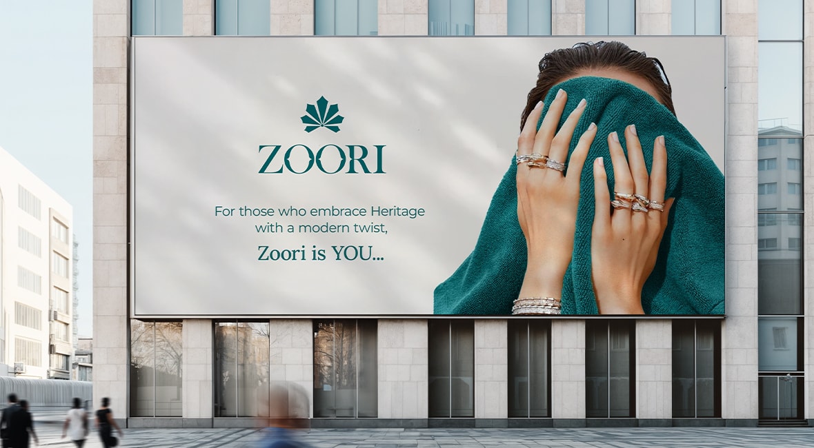
ZOORI entered a space crowded by extremes, either mass-market dazzle or cold, exclusive luxury. The brand needed to speak to a modern customer: design-aware, emotionally driven, and unwilling to compromise on clarity or craft. Our task was to build more than a brand, we had to design an ecosystem rooted in meaning, not just margins.
What would it mean to feel seen, not sold to? That was the question we kept returning to. Every brand decision was filtered through this lens: warmth, not noise; elegance, not excess; clarity, not clutter. ZOORI would become the jewellery brand that behaves the way customers wish others did.
We defined ZOORI around two core truths:
→ Clarity in how it communicates, prices, and presents→ Care in how it listens, customises, and responds
We didn’t build a jewellery line. We built a brand for intentional living, where every product, process, and post carries meaning. The tone is assured, never aloof. The name itself, ZOORI, is neutral and textured, reflecting grace without leaning into ornament.
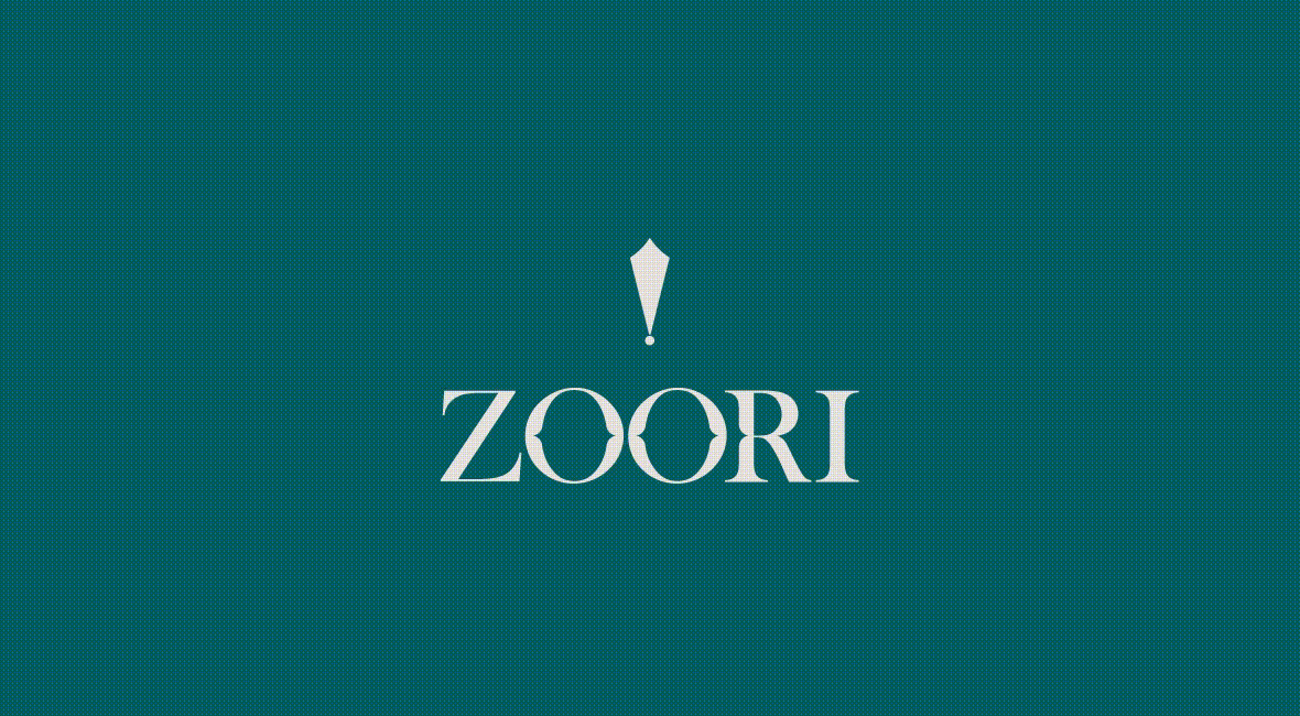
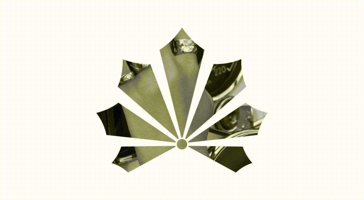
The brand’s visual identity began with a dot. The smallest design unit. The start of a sketch, a story, a piece of jewellery. This became ZOORI’s anchoring idea: modular, scalable, and quietly poetic.
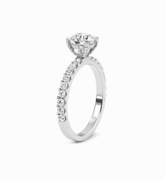
The design language avoids clichés. No unnecessary gold, no ornamental noise. Instead:
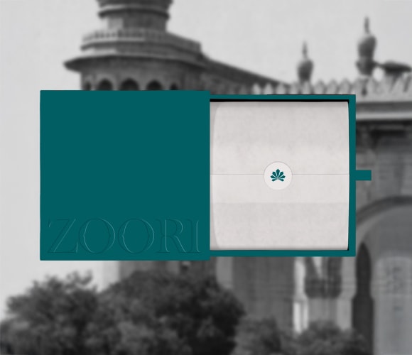
→ Soft, tactile colour palettes → Clean, precise typography → A scalable dot-based visual system adaptable across platforms
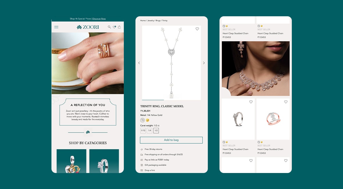
The digital experience mirrors the physical, structured, serene, and intuitive.
ZOORI now operates as a clarity-first luxury brand. It has carved a space between sterile minimalism and overbuilt opulence, earning trust by design.

View All Work
Got a project? let’s talk
Prefer reaching out directly?


ZOORI
Fine Jewellery · D2C Luxury
Clarity-first luxury brand
Services
Brand Strategy
Visual Identity
Naming
Brand Book
Website UI/UX
Read more+
ZOORI entered a space crowded by extremes, either mass-market dazzle or cold, exclusive luxury. The brand needed to speak to a modern customer: design-aware, emotionally driven, and unwilling to compromise on clarity or craft. Our task was to build more than a brand, we had to design an ecosystem rooted in meaning, not just margins.
What would it mean to feel seen, not sold to? That was the question we kept returning to. Every brand decision was filtered through this lens: warmth, not noise; elegance, not excess; clarity, not clutter. ZOORI would become the jewellery brand that behaves the way customers wish others did.
We defined ZOORI around two core truths:
→ Clarity in how it communicates, prices, and presents→ Care in how it listens, customises, and responds
We didn’t build a jewellery line. We built a brand for intentional living, where every product, process, and post carries meaning. The tone is assured, never aloof. The name itself, ZOORI, is neutral and textured, reflecting grace without leaning into ornament.
The brand’s visual identity began with a dot. The smallest design unit. The start of a sketch, a story, a piece of jewellery. This became ZOORI’s anchoring idea: modular, scalable, and quietly poetic.
The design language avoids clichés. No unnecessary gold, no ornamental noise. Instead:
→ Soft, tactile colour palettes → Clean, precise typography → A scalable dot-based visual system adaptable across platforms
The digital experience mirrors the physical, structured, serene, and intuitive.
ZOORI now operates as a clarity-first luxury brand. It has carved a space between sterile minimalism and overbuilt opulence, earning trust by design.

View All Work
Got a project? let’s talk
Prefer reaching out directly?
ZOORI
Fine Jewellery · D2C Luxury
Clarity-first luxury brand
Services
Brand Strategy
Visual Identity
Naming
Brand Book
Website UI/UX
Read more+
ZOORI entered a space crowded by extremes, either mass-market dazzle or cold, exclusive luxury. The brand needed to speak to a modern customer: design-aware, emotionally driven, and unwilling to compromise on clarity or craft. Our task was to build more than a brand, we had to design an ecosystem rooted in meaning, not just margins.
What would it mean to feel seen, not sold to? That was the question we kept returning to. Every brand decision was filtered through this lens: warmth, not noise; elegance, not excess; clarity, not clutter. ZOORI would become the jewellery brand that behaves the way customers wish others did.
We defined ZOORI around two core truths:
→ Clarity in how it communicates, prices, and presents→ Care in how it listens, customises, and responds
We didn’t build a jewellery line. We built a brand for intentional living, where every product, process, and post carries meaning. The tone is assured, never aloof. The name itself, ZOORI, is neutral and textured, reflecting grace without leaning into ornament.
The brand’s visual identity began with a dot. The smallest design unit. The start of a sketch, a story, a piece of jewellery. This became ZOORI’s anchoring idea: modular, scalable, and quietly poetic.
The design language avoids clichés. No unnecessary gold, no ornamental noise. Instead:
→ Soft, tactile colour palettes → Clean, precise typography → A scalable dot-based visual system adaptable across platforms
The digital experience mirrors the physical, structured, serene, and intuitive.
ZOORI now operates as a clarity-first luxury brand. It has carved a space between sterile minimalism and overbuilt opulence, earning trust by design.
View All Work
Got a project? let’s talk
Prefer reaching out directly?


ZOORI
Fine Jewellery · D2C Luxury
Clarity-first luxury brand
Services
Brand Strategy
Visual Identity
Naming
Brand Book
Website UI/UX
Read more+
ZOORI entered a space crowded by extremes, either mass-market dazzle or cold, exclusive luxury. The brand needed to speak to a modern customer: design-aware, emotionally driven, and unwilling to compromise on clarity or craft. Our task was to build more than a brand, we had to design an ecosystem rooted in meaning, not just margins.
What would it mean to feel seen, not sold to? That was the question we kept returning to. Every brand decision was filtered through this lens: warmth, not noise; elegance, not excess; clarity, not clutter. ZOORI would become the jewellery brand that behaves the way customers wish others did.
We defined ZOORI around two core truths:
→ Clarity in how it communicates, prices, and presents→ Care in how it listens, customises, and responds
We didn’t build a jewellery line. We built a brand for intentional living, where every product, process, and post carries meaning. The tone is assured, never aloof. The name itself, ZOORI, is neutral and textured, reflecting grace without leaning into ornament.
The brand’s visual identity began with a dot. The smallest design unit. The start of a sketch, a story, a piece of jewellery. This became ZOORI’s anchoring idea: modular, scalable, and quietly poetic.
The design language avoids clichés. No unnecessary gold, no ornamental noise. Instead:
→ Soft, tactile colour palettes → Clean, precise typography → A scalable dot-based visual system adaptable across platforms
The digital experience mirrors the physical, structured, serene, and intuitive.
ZOORI now operates as a clarity-first luxury brand. It has carved a space between sterile minimalism and overbuilt opulence, earning trust by design.

View All Work
Got a project? let’s talk
Prefer reaching out directly?