Strategy, Identity Design, Brand Icon, Messaging, Artist Bio, Brand Book
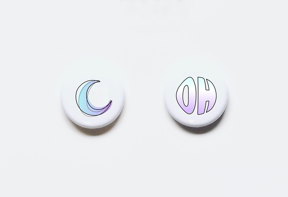
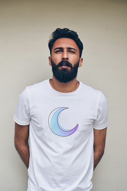
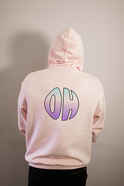
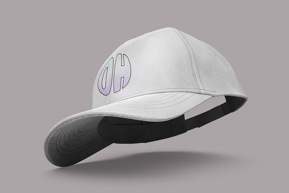
Soham is a self-taught, proud queer indie artist who started composing music to express his struggles, conversation, and experiences. His writing has a soothing yet honest voice, taking inspiration from which we designed his logo and chalked up his branding accordingly.
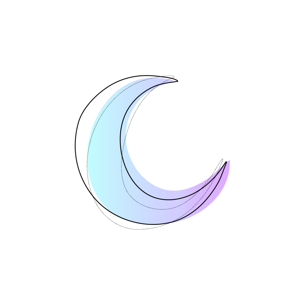
We designed his identity, taking a couple of letters from his name ‘SOHAM’. The letters together make up the word ‘OH’, an expression that conveys a range of emotions, including surprise, joy, pleasure, etc., which is precisely the kind of emotions that his music brings out in people. The font we chose for his branding connotes his ease of adaptability, with which he warms into his audience’s heart with his soothing lyrics and empathetic music. The icon is a crescent moon inspired by the tattoo on his wrist to create a sense of nostalgia and warmth that he, as well as his music, allude to.